Accessibility isn’t just a concern for web developers. With content being dynamically created, there are a few points content editors can keep in mind to make sure their content is accessible to everyone. Following accessibility standards helps non-visual users, but can also help all users find and understand the information they’re looking for.
Creating Emphasis
One of the most common times accessibility issues pop up is when content editors are trying to emphasize sections of text. It is important to keep in mind that screen readers do not recognize details like different colors or bolded text, but will intonate exclamation points. If it is vital to the understanding of the content that a certain sentence be highlighted, consider using an exclamation point. If it is not vital but may help visual users to better understand the message, your best bet is making use of bold.
From a usability standpoint, be wary of using color for emphasis. Colors can have unintended implications, such as causing the user to think the text is a warning, or even a link. Text also has to pass a certain color contrast ratio with its background to maintain accessibility, so unless a designer or developer with a knowledge of accessibility has picked out new colors for you, it’s best not to introduce more.
Another common mistake when emphasizing content is using all uppercase letters. A screen reader will read this out like an acronym, which could be particularly painful for a full sentence. Aside from screen readers, it is also shown to be less readable for all users when there are more than one or two words in a row in all-caps. Sometimes you’ll see all-caps used on buttons or labels, but the crucial difference is that these are (or should be) made into all-caps with code. A screen reader will usually ignore the css and see the text as it is originally written.
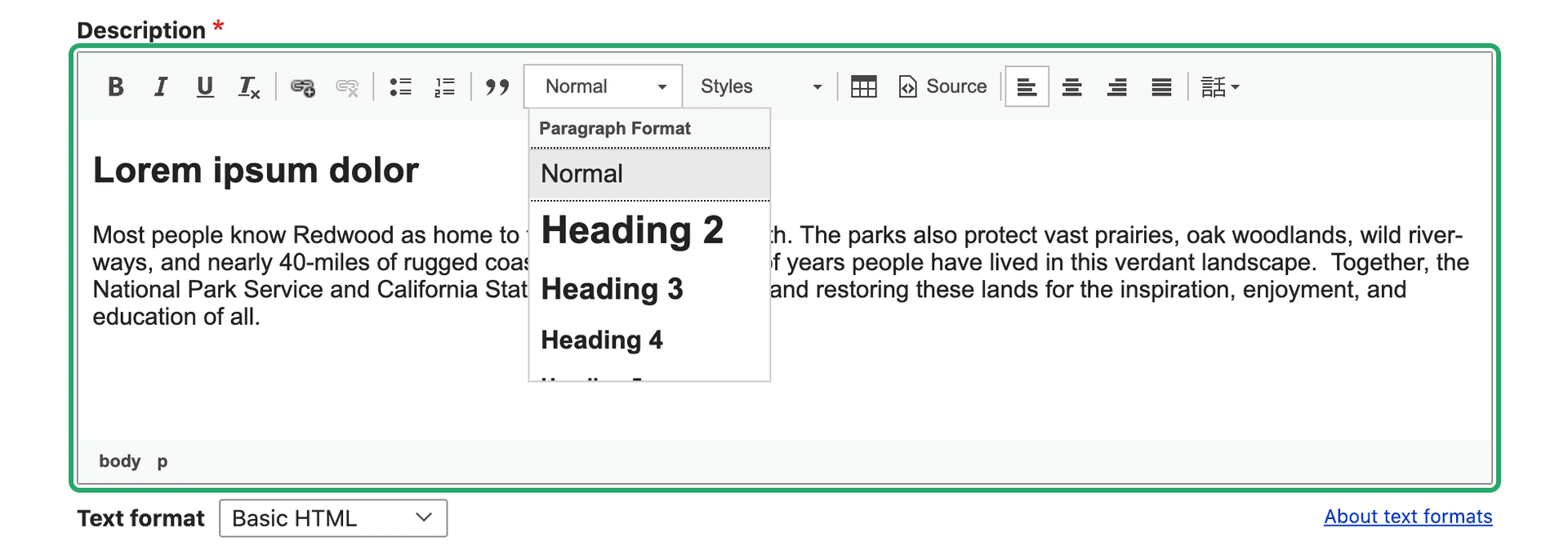
Is bold not enough variation for your content? Talk to your designer or developer about coming up with additional text styles for you to use. You may think to yourself, “I already have a dropdown with five different text styles I can use!” What you’re probably referring to is the heading selector.

Headings should never be used for emphasis or a stylistic choice. They are a tool to add structure to a page.
Heading Structure
Headings are pieces of HTML that are used to give structure to a page. They make it possible for non-visual users to navigate and understand a page without needing to see visual indicators. There is a specific way headings need to be arranged on a page.
Headings are nested, just like you would see in an outline of a paper where subsections are indented and have a different bullet point or character. Heading 1 is the topmost level, functioning as the title of the page. There should only ever be one H1 on a page, and if you’re using Drupal or any other content management system, the H1 is probably already generated for you as the page title. If you’re working in a body field, for example, you’ll most likely start with H2 to title a section of content. Anything else at this same section level will also be an H2. If you need to label sections within this section, you can start to use H3’s. If you need to go any deeper than this, you can start to use H4’s, H5’s, and H6’s, but if you are going this deep into the structure, it may become difficult to follow for your average user. Here’s an example of heading structure:
(H1) The Most Amazing Chocolate Cake
(H2) My Grandmother’s History
(H2) Ingredients
(H3) Types of flour you can use
(H3) Alternative ingredients
(H4) Vegan alternatives
(H4) Gluten free alternatives
(H2) Instructions
(H3) The cake
(H3) The frosting
An important thing to watch out for is that heading levels don’t skip. You don’t want to go from an H2 right to an H4. That makes it more difficult for non-visual users to understand the structure of the page, and creates inconsistencies for all users. If you keep finding yourself tempted to do this for visual reasons, think about why it feels like the heading style available doesn’t fit, and work with your designer to figure out how best to fix it.
As mentioned before, don’t use headings simply to emphasize text. If you’re making a whole sentence into a heading, it’s probably not the right use. Headings are also not designed to be used for long sections of text. Bigger and bolder does not always mean easier to read. Sometimes a pull quote or a custom text style is an option that will accomplish what you’re looking for, without creating accessibility and usability issues, as well as design inconsistencies between different content editors.
Foreign Languages
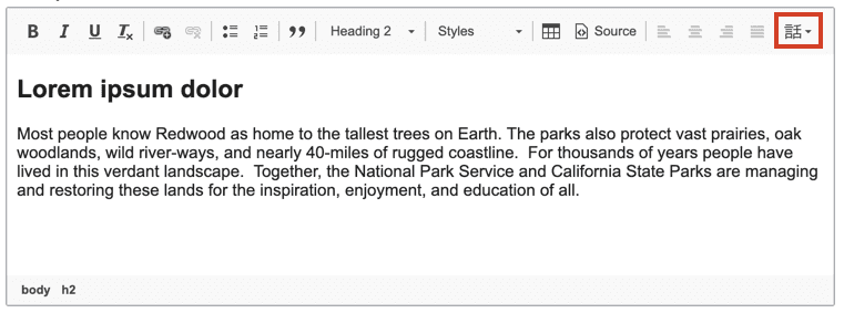
Sometimes on your site you’ll need to add text in a different language. Visual users can identify when they won’t be able to read something, but screen readers need a hint that a sentence is in a different language. There’s a simple way to add this hint to your text: the language button. When you add content to a text field, usually you will have a toolbar at the top that allows you to make things bold, add a link, etc. One button that you may see if you’re using Drupal looks like this:

If you see this button, you can highlight your text and select from the dropdown. If you don’t see this button, or any buttons, ask your developer to make it available for that field.
Another thing to note with foreign languages is that users can use external tools to translate the content into a language they understand. For this reason, it is best to stay away from made up words that would only make sense in the language you’re writing, but not others (i.e. “hangry”).
Special Characters
One more content writing trend to avoid is replacing letters with characters, for example “$ave ₵ash” or “see u l8r.” This causes predictable issues for translation and screen readers, but it also can show up incorrectly for anyone. If you have an article titled “$ave ₵ash” it will show up in the url as something like this: yoursite.com/news/ave-ash, which could lead to some confusion when sharing links. The “u” in “see u l8r” would most likely be understood by a non-visual user, but would be impossible to translate.
Writing Accessible Links
Writing good link titles is important, and once you understand how non-visual users navigate a page, it’s easier to accomplish. These links could be inline links, such as a word in a sentence, or could stand alone, such as a button. Regardless, what you want is for link titles to be able to stand on their own. This is because one navigational tool that assistive technology provides users with is a list of links that appear on the page. Imagine a list of links that says “click here,” “learn more,” and “download.” These links don’t give the user any context or information about where the links will go. Instead, create links with text that gives users an understanding of what exactly that link will be doing. No user wants to waste time clicking on a link gives them an unexpected result.
W3.org gives these as examples of successful links (URI refers to the link destination):
A link contains text that gives a description of the information at that URI
A page contains the sentence "There was much bloodshed during the Medieval period of history." Where "Medieval period of history" is a link.
A link is preceded by a text description of the information at that URI
A page contains the sentence "Learn more about the Government of Ireland's Commission on Electronic Voting at Go Vote!" where "Go Vote!" is a link.
Meaningful link text also helps users tabbing through a page from link to link. Users can more easily navigate and determine where to go next without spending more time than wanted on an intermediary page.
Learn more about link accessibility at w3.org.
Writing Good Alternative (Alt) Text
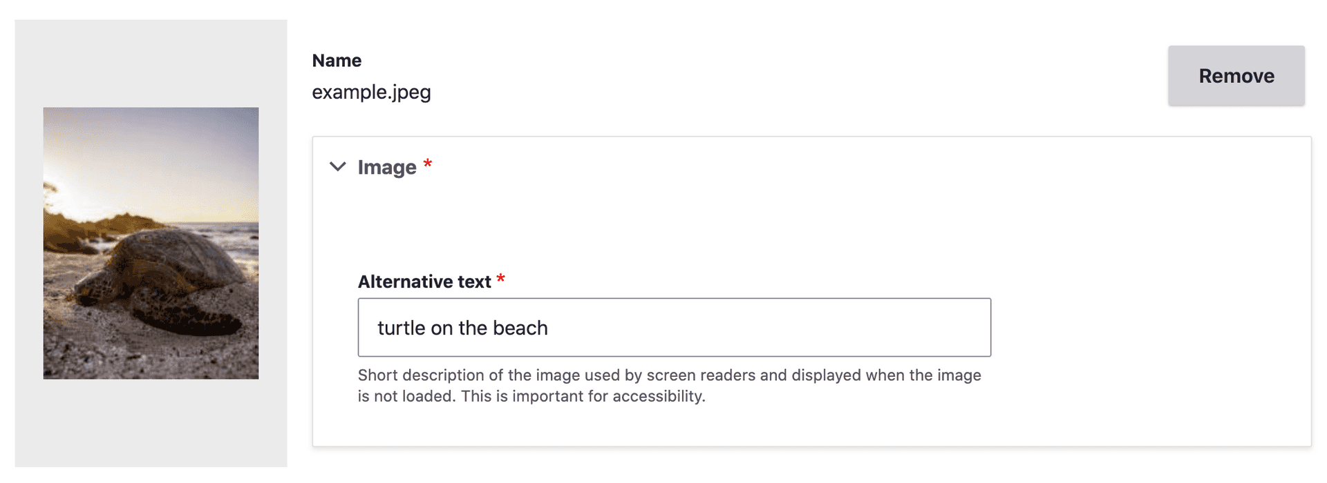
Images that you add to your page need good alt text. When using a content management system, you’ll see a field show up when you add an image, asking for alt text. Alt text allows non-visual users to get the same basic information that the image is giving to a visual user. It is what shows if an image doesn’t load, whether because of a broken image link(?) or a user’s limited internet access. It also provides information to search engines.
Writing good alt text can feel a bit tricky at first. What you want is for your alt text to communicate the content and function of the image. Think of alt text as what you would want to appear in the place of the image if you couldn’t use it. You’ll want to be succinct in describing the image, and avoid any redundancy with the text around it. Screen readers will know that it’s an image, so don’t add text like “image of…” Think about what information is and isn’t helpful, and why you’re adding an image in the first place. Is it just to take up space next to text, or is there something important being conveyed through that image? An image of students on a quad conveys information about student life at the university, whereas a cartoon image of a backpack likely doesn’t add any information.

Sometimes the alt attribute of an image should be empty. The alt attribute is the piece of HTML that is holding the alt text you enter when you first add an image. You may instead have a label below your image that is visible to all and acts as alt text. You wouldn’t want a screen reader to read out what would ultimately be the same text twice, so you’ll want an empty alt attribute on the image. The only instance where you want no alt text at all is when an image is only decorative, such as a swirling line between text sections or a generic image added only to break up the text (like the previous backpack example). Alternative text may be a required field when you add an image, in which case adding empty alt text by typing a single space in the field might work for you. If this doesn’t work, you may want to talk to a developer about making alt text optional. Consider how many content editors your site has, and if they all have accessibility training. If it is possible that a lot of images that need alt text could end up without it, it may be best to keep it required and minimize using images that don’t add meaning to a page. If the image has alt text in a caption already and you need to add something into the alt text field to be able to save it, try to add context that isn’t already clear from the caption. In most cases you will want alt text anyway, but ask yourself if the alt text you’re adding will be a help or an unnecessary hindrance to a non-visual user.

When an image is linked, and is the only thing in the link, the alt text needs to describe the function of the link. This is because the link doesn’t have any other text in it, so any clue as to where the link is going to go is taken from the alt text. In this case, you can write alt text as if you were writing link text.
For some great examples of how to write alt text, take a look at the list provided by webaim.org.
Conclusion
Once you understand how different users are experiencing your content, writing with accessibility in mind starts to get easier. It’s not always the most exciting and creative part of writing content, but it can be a rewarding experience to continually remind yourself to think about users that often can be overlooked. Putting yourself in someone else’s shoes can help build empathy and make the web, and particularly your piece of it, a more positive space for all.
