


It all started with an innocent tweet:
https://twitter.com/mirisuzanne/status/948637526612324352
"Excited to announce our new open-source, Sass-driven pattern-library generator! Go design some systems!"
I follow Miriam on Twitter because I love everything she's ever done. At Redfin, we were huge fans of Susy, right up until she told us not to use it any more. And, like everyone else in the Drupal community and web developer community at large, we're hearing more and more about Atomic Design and the use of pattern libraries to build websites. We're encouraged to build and use canonical and living style guides. Many tools have come forward and, in the Drupal world, it looks like Pattern Lab has been a big winner.
At Redfin, we've tried a number of these tools, including Sam Richard's Style Prototyping approach, and attended trainings for Pattern Lab. We've also experimented with KSS for documenting Sass and generating a style guide.
Why Herman
What attracted me to Herman was the common predicament of the small-to-medium project and its budget's ability (or inability) to deliver on these prototypes. From the Herman announcement on Oddbird:
Creating the beautiful Salesforce Lightning Design System requires an ongoing full-time dedicated team. Those of us doing agency work don't often have that luxury, but our clients still need a system that will work for them.
So how can we make design systems part of an agile process – growing slowly along-side the application, the same way we write and maintain test-coverage as part of any project? How do we make documentation and design consistency the path of least resistance?
I'm a big believer in systems. That is, I'm a big believer in systems that work. If a human doesn't want to use a system because it's too much of a hurdle, the system has failed, not the human. So, the idea of "the path of least resistance" is appealing to me (or perhaps I'm just lazy but, nonetheless, systems should be built for the lazy).
So, Herman came along with all this promise and sparkle and I decided to give it a whirl. For starters, Herman is based largely in the foundations of SassDoc. SassDoc shares a similar purpose with KSS, though, having now played with it, I find its syntax just a bit easier to understand. Perhaps, since I've learned PHP Annotations for Drupal, the annotations in SassDoc feel natural.
Getting Started with SassDoc
To this end, Herman is actually just a "theme" for SassDoc. So, to get started, you are going to initialize a new SassDoc project. Like most of the front-end world today, new front-end projects are initialized using a tool like Yarn or NPM. At Redfin, we use Yarn, so we initialized our project using "yarn init" and answering the questions as appropriate.
Once we were initialized, we added in our two dependencies - SassDoc and the Herman theme:
yarn add sassdoc sassdoc-theme-herman
Once that finishes, you have scaffolded out a Herman project… kind of. What you now need is all your Sass! Create a sass folder to get started and put a style.scss file in there. We'll start with something simple:
.button { border-radius: 5px; background-color: green; color: white; font-weight: bold; }
Here's our first simple component we'd like to document. Maybe, if you were lucky, you had SOME kind of note in there before, like // typical button styles or something.
SassDoc uses a "three-slash" syntax to pull comments in as documentation. So, let's enhance that a bit.
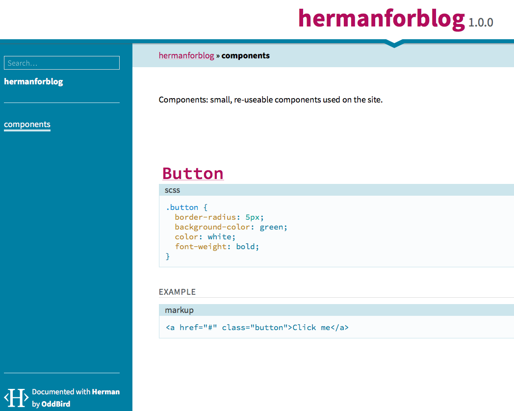
/// Components: small, re-useable components used on the site. /// @group components /// @name Button /// @group components /// @example html /// <a href="#" class="button">Click me</a> %button { border-radius: 5px; background-color: green; color: white; font-weight: bold; }
The first comment, which is offset by a newline from the rest, is called a "free-floating comment." It's just "out there," and not attached to anything. However, note that using the "group" annotation (@group components) I was able to assign it to belong to a group. Using other annotations, like name and example, I'm able to generate my style guide (at the end of the day, just a static site).
To generate, you need to be in the root of your project and run:
node_modules/sassdoc/bin/sassdoc sass --theme=herman
And this gives you the following static site (find it by visiting /sassdoc/index.html off your site's root):
Moving On
Let's get something different put together, a little more advanced. Let's throw in a mixin.
@mixin embed-container($width, $height) { $ratio: ($height / $width) * 100%; position: relative; padding-bottom: $ratio; height: 0; overflow: hidden; max-width: 100%; iframe, object, embed { position: absolute; top: 0; left: 0; width: 100%; height: 100%; } }
This mixin is inspired by Smashing Magazine's timeless article on the subject.
Now, let's annotate! Put this directly above your mixin.
/// Mixins: custom re-useable but configurable tools we use. /// @group Mixins /// Helper mixin to drop on the wrapper for an iframe /// that you would like to be responsive. /// /// @group Mixins /// @author Smashing Magazine /// /// @param {Length} $width - Element's width /// @param {Length} $height - Element's height /// @output CSS for the wrapper and the inner iframe that maintains the aspect /// ratio as it is resized. /// /// @example scss - /// .embed-container { /// @include embed-container(400px, 300px); /// }
The above documentation introduces us to the @parameter annotation, which allows us to document a parameter, its type, the name, a default value, and a description, using the syntax:
/// @param {type} $name [default value] - description
Also, note that we're not displaying markup here for our @example annotation; rather, we're using scss for the syntax to output. For mixins, this is incredibly helpful as it can show us what the compiled CSS is as a result of using this mixin! Let's go ahead and compile again (node_modules/sassdoc/bin/sassdoc sass --theme=herman).
UH-OH!
» [WARNING] Error compiling @example scss: no mixin named embed-container Backtrace: stdin:2 .embed-container { @include embed-container(400px, 300px); }
SIDE NOTE: In addition to being confused, I bet you're already tired of specifying --theme=herman on the command line every time, huh? Let's kill two birds with one stone.
Rather than specifying your Herman parameters every time on the command line, you can specify them in a JSON or YAML file. In that way, you then only specify -c /path/to/config every time. Of course, at this point, you're just robbing Peter to pay Paul. Switch one command line option out for another.
There's an even better option. Just name your config file .sassdocrc and put it in the root of your project and it will be automatically used. The entirety of that file (so far):
theme: herman
However, we haven't yet solved the problem of "no mixin named." See, the @example annotation from SassDoc doesn't natively support compiling Sass into its CSS counterpart. That's a gift from Herman. In order for Herman to compile the SCSS into CSS, though, each @example must be able to stand on its own, and this was the one area that really tripped me up. Thankfully, Miriam was there to help out.
To make this work, one option is to import the Sass file that we need in order for the example to stand on its own. Change your example to this:
/// @example scss - /// @import "style.scss" /// .embed-container { /// @include embed-container(400px, 300px); /// }
I'll save you some time before you run off ahead and compile--this still won't work. But, it's easy to fix. Go back to your .sassdocrc and specify a "herman" object with some configuration. (Full details on the herman object configuration.)
Make your .sassdocrc like this now:
theme: herman herman: sass: includepaths: - 'sass'
The includepaths directive is important so that Herman can resolve your import statements. Want to do one better? You can auto-import a path (or paths) using another declaration but, beware--nothing you auto-include should generate any actual Sass output or it will show up in EVERY example. This is best used for your utility files, like _extends.scss, _mixins.scss, etc. (Refer to our own Bundler Shell theme to see how we lay this out.) For example:
theme: herman herman: sass: includepaths: - 'sass' includes: - 'util/mixins'
If you auto-include your util/mixins (really ./sass/util/_mixins.scss) then you can make use of your mixins without needing to put the @import in every @example!
Another Side Note: README
If you are feeling harassed by "[WARNING] Description file not found: `./README.md` given." It's probably best to have a README.md for your project. This shows up as the text of the index.html page for the top-level of your SassDoc project. I just went ahead and created a simple one. This is a SassDoc configuration value, and if you'd rather create an introduction to your style guide that is separate from the main README for your project, you can set descriptionPath in your .sassdocrc file.
Level Up
This is all great but, we need to level up. What else does Herman offer?
No one can say it better than their own README:
In addition to the core SassDoc annotations, our @icons annotation allows you to display SVG icons from a given folder, and we extend the core @exampleannotation to display compiled Sass/Nunjucks output and render sample components. We also provide a @font annotation for displaying font-specimens, and @colors, @sizes, and @ratios annotations for displaying color-palettes, text and spacing sizes, and modular ratios."
Icons
This one is easy so we'll start here. Add a comment and use @icons \<path-to-icons-relative-to-project-root> and you're there! It auto-generates your icon previews with filenames, even optimizing them as it goes. (Bear in mind your SVG's should specify a viewBox or they will likely be very, very tiny in the preview.) It expects a folder with individual SVG files per icon.
Font Stack Previews
Things start to get a little trickier starting here. For the fonts, colors, ratios, and sizes annotations, you will need to generate some JSON that the front-end JavaScript/templates can use. There's a plugin called sass-json that is doing this for you--taking sass maps and writing them out to encoded JSON--but you need to export your data in order to do this. So, let's dissect the font annotation first.
/// @font key (styles, to, show)
In this case, the ‘key' is the variable name of the Sass map holding the information about your font style, and the (styles, to, show) are a list of font weights/styles that you would like to display, for example: (regular, bold, bold italic).
Note that, at least for Google Fonts, the numbers are a more consistent thing to use when outside of the normal keywords of bold and regular. I didn't have success with previews using things like "semibold" or "light." (This is because they only support valid CSS values for font-weight - though there's discussion around that: https://github.com/oddbird/sassdoc-theme-herman/issues/250 ).
Finally, the second line is indented, to show that it's still part of the @font annotation, and it consists of any markup needed for the font to render correctly (JavaScript tag, link tag, etc).
So, in real life, this looks like:
/// @font sans-stack (300, 300 italic, regular, 600) /// <link href="https://fonts.googleapis.com/css?family=Work+Sans:300,400,600" rel="stylesheet"> $sans-stack: ( 'name': 'Work Sans', 'source': 'https://fonts.google.com/specimen/Work+Sans', 'stack': ("Helvetica Neue", "Lucida Grande"), );
For a web font like this, we use the name (that is, the actual font name you would use if you were to display it in a font-family property), source (this renders as an external link when the preview displays), and stack (which are the fallbacks you've chosen when this font is not available).
Getting that to render, though...
This is all the annotation related to the font, specifically, but now we need to include this Sass map into the "herman" map more globally. There's a handy mixin that Herman provides, called "herman-add" which we can use to do that. After the map, I put:
@include herman-add(‘fonts', ‘sans-stack', $sans-stack);
In order to use this herman-add mixin, you will need to include Herman's utilities (where this mixin is defined), so at the top of my file I put:
@import "../node_modules/sassdoc-theme-herman/scss/utilities/_utilities.scss";
Finally, we need to do a final export of the Herman map into JSON. At the bottom of my Sass file, I put:
@include herman-export;
This ensures that the herman map is exported to JSON so the front-end can pick it up. The Herman team is currently working on improving this process but, for now, this is still a pretty clean way to handle it. If you get a little cuter than I did with your partials, you can have a Sass file that only outputs the herman map JSON so you don't need to pollute your regular CSS with it if you don't want to.
Keep this pattern in mind, because most of Herman's awesomeness depends on it. You'll see as we move on.
Colors
Now that we've established a pattern, we're keen to keep following it. For color palettes to be generated in your SassDoc static site, we'll follow a similar pattern. First, the annotation:
/// @group colors /// @colors demo-colors $demo-colors: ( 'alto': #d8d8d8, 'scorpion': #5b5b5b, 'tree-poppy': #f36c38, 'white': white, 'wild-sand': #f5f5f5, 'grey-light': #d5dbe4, ); @include herman-add('colors', 'demo-colors', $demo-colors);
First, I use the @group annotation to put this in the ‘colors' navigation over at the left. Then, the actual @colors annotation puts the map key you're going to use to add to the Herman map. We add those colors in a map, and then finally use herman-add to map $demo-colors into $herman. In this way, the herman-export we call at the very end will ALSO now include this color palette in the static site.
Sizes
For text sizes, a great preview can be generated to show you the various headings or sizes you want to use. Sense a pattern yet? Let's look:
/// All the sizes that we have. /// @group sizing /// @sizes font-sizes {text} $font-sizes: ( 'base': 16px, 'important': 1.8rem, 'largest': 3rem, ); @include herman-add('sizes', 'font-sizes', $font-sizes);
Ratios
Ratios behave nearly identically:
/// Ratios we are using. /// @group sizing /// @ratios my-ratios $my-ratios: ( 'line-height': 1.4, 'gutter': 0.5, ); @include herman-add('ratios', 'my-ratios', $my-ratios);
The only thing to know is that you can optionally display text sizes (or spacing sizes, or page sizes) as rulers, though the default is to display a text preview. To do this, add the optional "{rulers}" or "{rulers-large}" after the sizes annotation (rather than "{text}" - which is the default).
Nunjucks - Martial arts the templates up a notch
For markup that is more complicated than some simple HTML, you can write a Nunjucks template to generate output for a preview. Let's enhance our button example with a Nunjucks template.
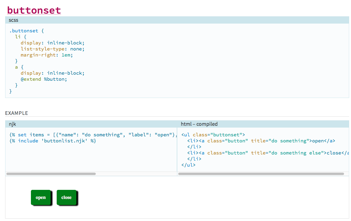
/// @group components /// @name buttonset /// @example njk /// {% set items = [{"name": "do something", "label": "open"}, {"name": "do something else", "label": "close"}] %} /// {% include 'buttonlist.njk' %} /// .buttonset { li { display: inline-block; list-style-type: none; margin-right: 1em; } a { display: inline-block; @extend %button; } }
You'll notice I still put this in the components group but I've turned my regular button into a buttonset. You'll also notice immediately the @example annotation this time specifies the "njk" syntax, meaning "compile Nunjucks code." When using njk in an annotation, you are required to specify a templatepath in your config. (Alternatively, you can specify an entire Nunjucks environment, but to do that you must be using the Node API version, which I am not.) Add this to your .sassdocrc inside herman:
nunjucks: templatepath: './templates'
So, I created a "templates" folder off the root of my project and put a simple buttonset.njk file in it. (Dear Drupalists, don't be scared of Nunjucks--it's Django/Jinja-based templates for JavaScript, just the same way Twig is Django/Jinja-based templates for PHP!)
{% block content %} <ul class="buttonset"> {% for item in items %} <li><a class="button" title="{{ item.name }}">{{ item.label }}</a></li> {% endfor %}` </ul> {% endblock %}
Now that I've configured a templates directory, and my syntax for using the templates is all set up, I get a fully rendered example. It includes (a) the Nunjucks language used to generate it, (b) the fully compiled HTML markup, and (c) a fully rendered example with all of my styles!
For bonus points, check out Nunjucks macros, which should help you further componentize your markup into easily-reproduced snippets. If we do it this way, we can sort of reverse the order. First, we import our njk file which defines our macro:
/// @name buttonset /// @example njk /// {% import 'buttonset.macro.njk' as mymacro %} /// {{ mymacro.buttonset([{"name": "do something", "label": "open"}, {"name": "do something else", "label": "close"}]) }}
...and our Nunjucks template is slightly different, wrapping the block with a macro call. A macro is similar to a "function."
{% macro buttonset(items) %} <ul class="buttonset"> {% for item in items %} <li><a class="button" title="{{ item.name }}">{{ item.label }}</a></li> {% endfor %} </ul> {% endmacro %}
The Power
So, by combining all of these elements directly into the Sass you're writing for your agile site, you can document on the fly and have an easy way to:
- Reference and document your mixins
- Display typography stacks and document when you should use each
- Show heading sizes and spacing ratios for vertical rhythm
- Discuss branding color palettes and describe how each should be used
- Demonstrate the icon set available to the application quickly
- ...and so much more!
The Review
So what do I like and dislike about this? What did I learn?
For someone like me, a lot of this was actually quite new coming in. Not just the fundamental concepts that Herman brought, but all of it. I had never used SassDoc before, though I'd played briefly with KSS. I'd never even heard of Nunjucks before, though I had used Twig. But also, the concepts that give Herman its power also add complexity to an already complex stack. You need to remember that, in a sense, everything is compiling twice. Once, it's compiling your Sass to be output (and then you're bringing that output into the static site via custom CSS), but it's also compiling all the SassDoc comments into a static site as well. These two different steps are nonetheless sourced largely from the same files, so all the pieces of the puzzle feel like they need to fit together just right for everything to work in harmony. Once that was fundamentally understood, the idea of the JSON encoding actually made total sense, and was OK to understand.
I also spent a lot of time getting bit by the Ruby bug. At Redfin, we sort of skipped over the whole Gulp / Node API thing. We used a lot of Ruby Sass and Compass and Bundler, until we recently switched to a stack based on Dart-Sass. While trying to learn, I tried to strip everything down to its fundamental elements, and that actually got me a few times. I should've started with a modern stack and used the node-sass implementation that I installed with my yarn install, and I wouldn't have had such issues. (With that said, we never would've improved Herman to support Ruby Sass!)
Overall, I believe that this is definitely good enough to go into our next project. Beyond that, I am confident in the Herman team that if I find any bugs as we use it, they will be responded to swiftly, which is hugely important for adoption of something kind of new like this.
UPDATE 04-09-2018: Added additional clarifications from Miriam.