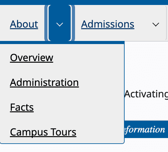
It's a standard component:
a menu where the user can hover over a top-level menu item to see its submenu
Almost every one of our clients has requested a variation of this at the top of every page of their website. Starting with Drupal 7, we became accustomed to a specific toolset for building these. There were lots of options, mobile support, and everything worked from our perspective and our client's perspective. But our menus had a bias towards visual users with a mouse. The words "hover" and "see" were in the definition of the component, actions only a subset of users can accomplish. Accessibility and inclusivity need to start at the roots, so we redefined the component:
a menu where each top-level menu item has a submenu that the user can choose to navigate
With this definition, it became obvious the component was broken for keyboard users, because they did not have a choice. Using a keyboard to navigate through menu links meant tabbing through every single submenu. So how do we do this better?
The Web Accessibility Initiative (WAI)
We started by looking at recommendations from the WAI Authoring Practices Guide and found the Disclosure Navigation Hybrid Menu. This component simply adds a toggle button to open submenus. Now all users have a choice.

Re-handling Hover
With the basic interface set, we needed to re-add the hover navigation. But this created a conflict. If a user hovers over the toggle button, the submenu should open. If a user clicks the toggle button, the submenu should toggle. So if a user hovers over a toggle button and clicks it, then the submenu is toggled open and immediately toggled shut. Here are some solutions we've built to resolve this behavior:
- Keyboard only: the toggle button can only be triggered by keyboard, not pointer devices.
- Only open: clicking the toggle button only opens the submenu.
- Hide until focused: visually hide the toggle button until it receives tab focus, so pointers can't access it by default.
Leveraging the Full-stack in Drupal
When rebuilding this component, we looked at existing Javascript libraries, but kept running into the same issues. Either they were so opinionated about the HTML that it was difficult to template in Drupal, or they were so generic that they were inconsistent and hard to customize. Finally we realized that we could write the template and Javascript in tandem and created a customizable component with less than 200 lines of Javascript and no external dependencies. In fact our accessibility standards actually made the functionality easier to code with the aria-controls and aria-labelledby attributes. For example, a toggle button for a submenu would have an aria-controls attribute set to the ID of the corresponding submenu, and the submenu would have its aria-labelledby attribute set to the ID of the toggle button. This is necessary for screen readers to communicate connections between elements that can't be seen, but it also makes it trivial to code the toggle interaction. Other libraries often create data-models of the menu to track these connections, but that's not necessary when everything is explicitly defined in the HTML. The only issue is generating unique ID's for all the toggles and submenus. But Drupal makes this easy for us with its HTML utility class which provides a simple getUniqueId method. And now in Drupal 10.2 there's a clean_unique_id function for Twig templates.
Contribution
And once all of that was figured out, we gave the component back to Drupal and, thanks to the community, made it stable and secure. So the next time a client needs a complex menu without losing accessibility, load up Disclosure menu and see if it fits your needs. If not, file an issue and let's make it better for everyone.
