As a designer and front-end developer, the infamous designer-developer handoff has often been between me and myself. Having spent a lot of time in both roles, as well as having worked closely with other designers and developers, I’ve learned a few practices that help me to answer developer questions right from the start.
Responsive Design
The first question to think about in the visual design stage is how a design will translate from a static idea to something people will use. In the real world, people are using all kinds of devices to interact with a website. There are a number of different use cases to think about here. For example, mobile users may be accessing a webpage without internet access, making an autoplaying video a concern for data usage. However, the most common and notable case to think about here is simply different screen sizes.
It’s pretty common to see mobile, tablet, and desktop designs handed off to a developer. If done well, these are generally enough for defining most of a website. Developers usually are working from 320px up, so it’s important to create mobile mockups at this size. From there we widen the browser to make sure the website still looks correct at the sizes in between what was provided in the mockups. The design for the mobile will be applied all the way up to one pixel below tablet size, and the tablet design will be applied up to one pixel below desktop (you may want to specify this for your developer).
For the most part, we want a consistent experience for each of these devices. If, for example, a user opens the website on an external monitor instead of their laptop, it shouldn’t look like a different website. That said, with some layouts the right breakpoint (browser width at which a component changes) is not right at one of the defined device sizes. As you’re designing, check if any of your components or page layouts need to switch at a more specific browser width. A good test of this is to create an artboard that’s a tiny bit smaller than tablet, and put everything in the mobile layout at that width. If anything looks off, consider defining a different breakpoint for that particular component.
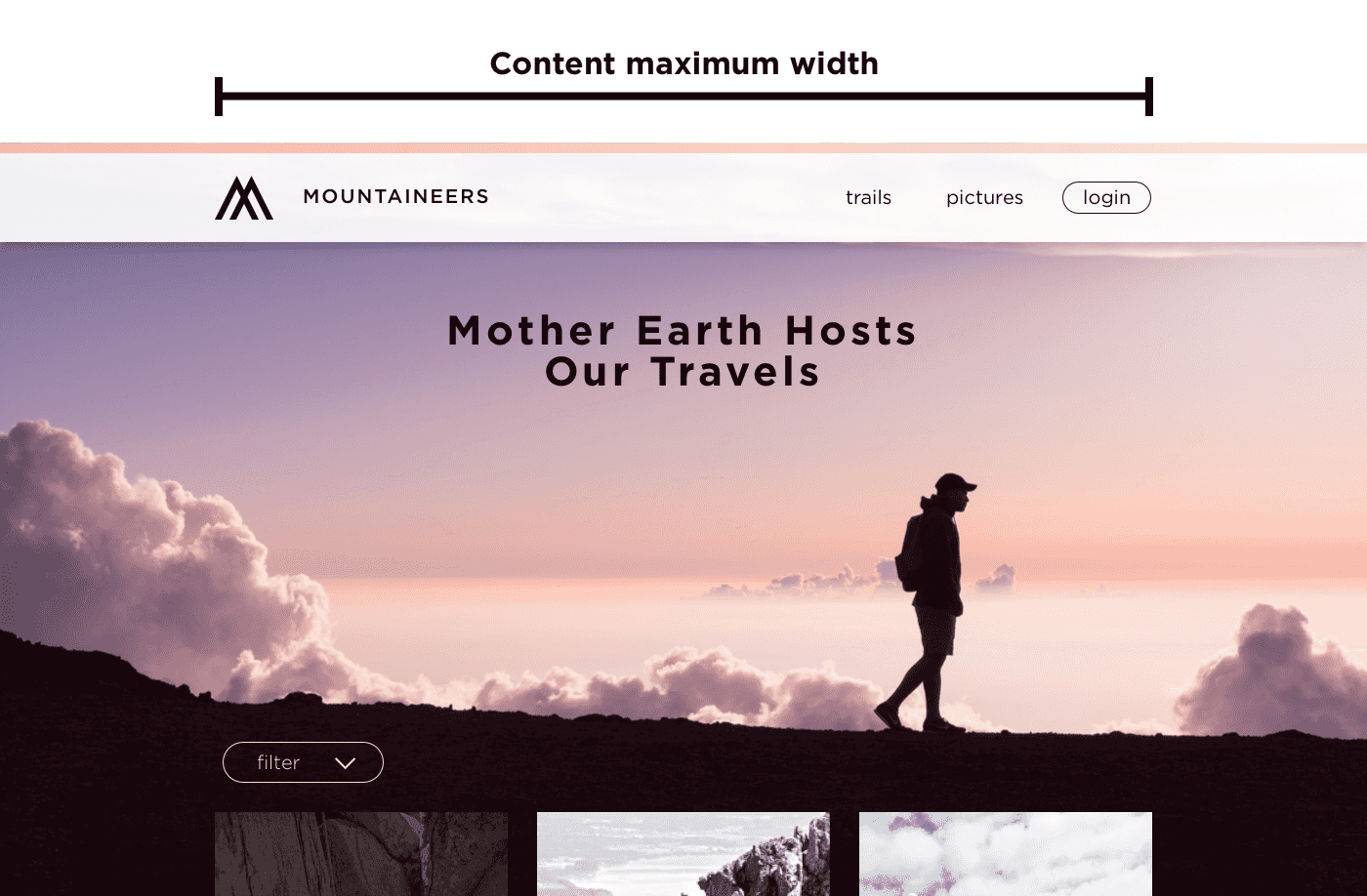
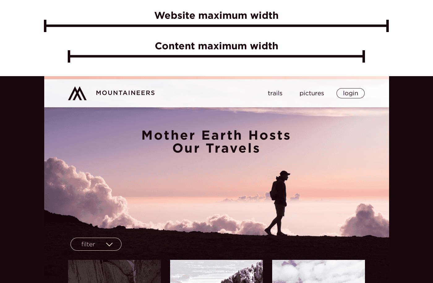
Another case to consider is when the website gets extra wide. The last thing you want is to present the final website to your stakeholders and find the components in disarray on a big TV. Generally I’ll define up to two widths for this. One is the content maximum width, and the other is the website maximum width.

The content maximum width is the size at which the components (such as text or an image) on the website stop increasing in width but the backgrounds (such as a background color or image) keep going. If your content maximum width is particularly large, keep in mind how all your components look stretched to that width. For readability and accessibility of any text on the website, remember that optimal line length is 45-75 characters.
This width may be all you need, but you can also define a website maximum width if you want something like an image background or full width slideshow to stop growing at a wider point. This may just apply to those full width components that are using images, or (less common in modern design) to the whole website. When deciding on whether or not full width components should keep stretching infinitely wide, think about how you want images to look on very large screens. Unless it’s a background image that is matching the height of that component, the wider an image gets, the more vertical space it will take. Also consider if you want large images to look clear at very large sizes or load quickly at normal and smaller sizes. Limiting the width an image component can reach is one way to strike a balance.

One last thing to define is the padding on the sides between tablet and desktop. When the width gets close to your content maximum width, how much padding stays on the sides as the content begins to shrink? I usually leave 16px between mobile and tablet, and 32px between tablet and the content maximum width (technically the content maximum width plus 64px so I don’t lose the padding too early).
Other common responsive considerations are typography and hover states. For typography, you’ll likely want to define heading sizes for mobile, tablet, and desktop. Also pay attention to line height, as well as spacing above and below a heading. For hover states, just remember that a mobile or tablet user can’t hover, so make sure none of the functionality is lost because of this.
Other tips
This covers most of the important points to keep in mind, but here are a few others:
Try to use a consistent base for sizing, preferably based on the body text size. I usually make my base font size 16px and then try to make typography and spacing stick with multiples of 4px.
Never type with caps lock. Always type in lower or sentence case and use your design software to transform the text to uppercase. This will help if you need to change that style without having to retype, and it allows developers (depending on your method of sharing designs) to copy and paste your text rather than retyping it. It also can be a good reminder to the developer that they should be using css to make text uppercase for accessibility (screen readers read text typed in all caps one letter at a time).
Make sure your images and text are flexible. If you have an image that perfectly lines up with the text overlaying it, be aware of how that component might be used and if the content editors will be changing the image or text. Similarly, be aware of the amount of text a content editor might add to any component. Character counts can always be limited, but it won’t hurt to supply that or show how the component should respond to having more text, especially if that text area is highly dependent on browser width.

One thing that can be easily overlooked is hover and focus states for any interactive elements of your website. For a website to be accessible, it has to be navigable with a keyboard. Focus states are what you see if you tab through a page, and if the difference isn’t notable it will be difficult to do this. Often, hover and focus states can be the same, but there may be some cases where you want to separate them. A form, for example, is an important place to have focus states defined, but you may not need hover states to work the same. Focus states that aren’t specified will generally be automatically provided by the browser, resulting in different appearances between browsers.
One last thing to establish while working with developers is a shared language. A paragraph or a block may mean something different to you as a designer then to a developer working in a content management system. Work together to make sure you have a common understanding of what some of these terms mean. A design system, or even a component library, is a great way to document this. We usually use Invision DSM to share a design system between designers and developers.
Summary
To review, remember the following things as you’re designing:
- Design mobile at 320px
- Define a content and website maximum width
- Create font styles for mobile, tablet, and desktop
- Use a consistent base for sizing, based on your body text size
- Get in the habit of using your UI to transform your text to uppercase
- Make images and text flexible whenever possible, and show components with varying amounts of content
- Provide hover and focus states
- Establish a shared language
When working with developers, it’s important to keep in mind the gaps between design and development when creating a website. While small design details may be obvious to you, a developer may be less aware of pixel distances and small color variations, focused instead on building the website in the best way possible. Ideally, design handoff is not one moment in a months long process, but a continual collaboration. Getting developer feedback while in the design process can save you from wasting time going down an unfeasible pathway, and getting across clear design patterns can ensure a developer makes the right assumptions from the beginning. Understanding a little of each other’s world can help make the whole process a lot smoother.
